I’ve seen a number of graphs that purport to show the left/right political divide, but I have never seen one that was quite right. Often, fascism is placed on one end, and communism on the other, but this ignores the fact that under both fascism and communism, the means of production are centrally planned. The difference between fascism and communism is purely based on the ownership of the means of production – under communism, the means of production are fully owned by the state, whereas under fascism, the means of production are still owned by predominantly private hands.
 Under a purely free system, private individuals have both full ownership, and full control, over the means of production, and individuals are free to do whatever they want. Though most people, myself included, believe that we need some government control to prevent us from harming one another, some people really do believe in anarchy.
If we were to slowly migrate from no government, to total government, we would see personal freedoms erode first, as government intervened, initially to prevent us from doing physical harm to one another, and later to control our behaviors in other ways. Eventually, as government begins to secure the border, and to provide for national defense, government spending would start to have a measurable impact on the economy, and economic freedom too would start to erode.
Economic freedom erodes more quickly than do social freedoms, with the government acting to control more and more of the means of production. Eventually, the government will take some of those means of production over, and the economy will move from free market capitalism toward fascism, socialism, and finally, communism.
A quick note on the use of the term ‘Fascism’ is in order, as the definition of ‘fascism’ has been played with quite a bit over the years. This article uses the original definition, which is described in the article, Fascism is Socialism 2.0.
Realistically, even after economic freedom is eliminated on the graph, people will still have a great deal of economic freedom within their everyday lives, but under fascism, socialism, and communism, people only have whatever economic freedom the government affords them. Under all three of these forms of society, government has control over every aspect of the human condition. Individuals can be said to administrator their own lives, but only within the parameters government sets, with a government that can change those parameters whenever it wants. In other words, while there may be some level of economic freedom under fascism, socialism, and communism, there is no guarantee of any economic freedom at all. Once you get to the middle of the graph, the people are the property of the government.
Self ownership is an important concept. Under feudalism, feudal lords owned the land, and this ownership extended to everything that lived on their land. Serfs were no more free than was livestock, both being the physical property of the feudal lord. In many cases the livestock was considered more valuable than were the serfs.
I don’t have feudalism listed on the graph, but if I did, it would be at the same point as communism, feudalism and communism being essentially the same. Feudalism is designed more for an agrarian society, and communism is designed more for an industrial society, but the communist party structure is really just a replacement for the nobility of a feudalist system, and just as under feudalism, the lord owns the serfs, so too under communism, the party owns the people.
Note that even under communism, the people can be allowed some level of personal and economic freedom, but they are mere administrators, with a government that can do whatever it wants, with no limits on its ability to control.
Some may notice that this graph reverses the political left and right. What we generally call ‘right wing’ is on the left of this chart, and what we generally call ‘left wing’ is on the right. I’m not going to suggest that we change our political jargon, but I do think that this chart is a more accurate representation of how societies are structured, with zero government on one side, and total government on the other.
From an ideological perspective, most people either want the masses left free, or controlled. From a practical perspective, most people realize that no ideology can survive in the extreme, such that the people can never be either fully free nor fully owned. Without some government constraint, people will harm each other. Without some freedom, there will be no incentive to produce. Most people want society somewhere between the extremes.
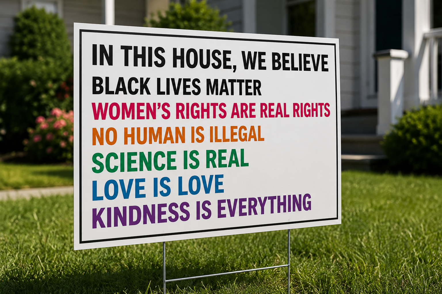
Today’s political left is a hodgepodge of groups that all want a great deal of government control over the means of production, but that differ greatly on how much government ownership they want. Those on the right are a hodgepodge of groups that want less government control, and markets that are relatively more free than they are today.
This is a very simple graph, but societies are not simple. There are a nearly infinite number of ways to gauge and measure a society, with a nearly infinite number of axis upon which to classify different aspects of a society. To accurately put a society on this graph, one would have to put a dot down for every one of the innumerable aspects a society can be measured by, and then one would gauge the overall location of the cluster of points.
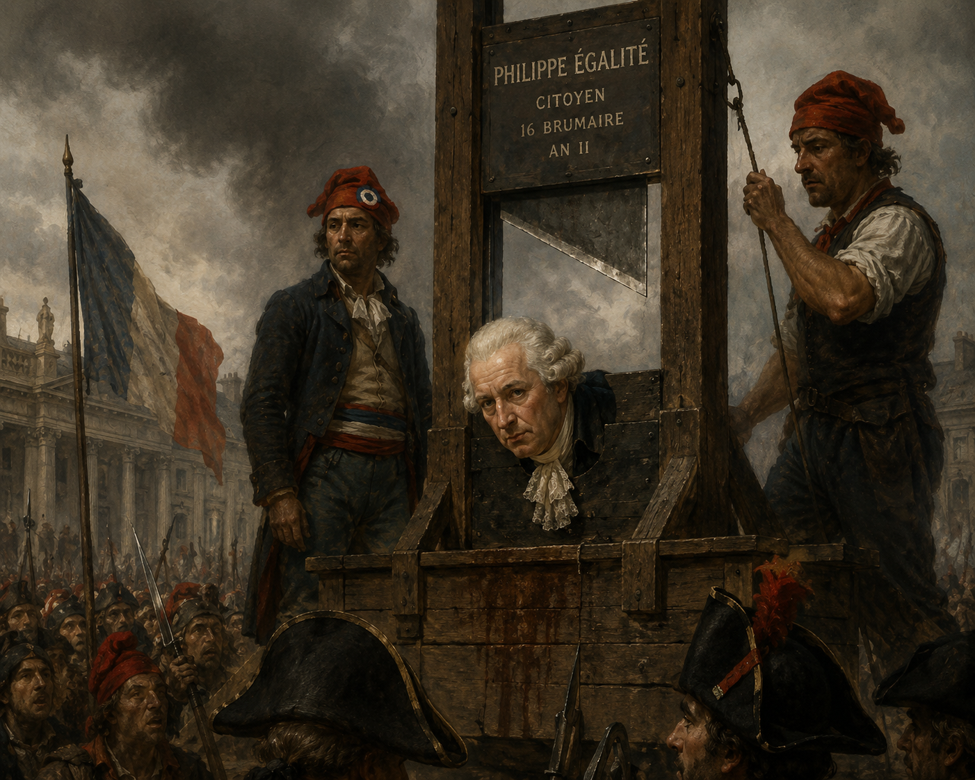
Franklin Delano Roosevelt was a fascist, who sent envoys to Mussolini’s Italy to try and determine how to bring fascism to the United States. Roosevelt even went so far as to try to enlarge the Supreme Court from nine members to fifteen, which would have allowed him to put six more people, of his own choosing, on the Supreme Court. Roosevelt wanted to choose people who would determine that fascist control was constitutional. Roosevelt failed to stack the court, but he was able to start the country on the road to fascism, such that if we look at the United States today, our government exerts a tremendous amount of control over our economy. Much of that control is subtle, such as tax policies that encourage particular behaviors, but subtle control can be invasive. Our government exerts a great amount of overt control as well. Every regulation, every government contract, every redistributed dollar, every subsidy, every edict by a regulatory agency, and every dollar spent by government – these things all represent government control over the economy.
In some ways the American economy still resembles a free market system, and in other ways it more resembles a socialist system. Overall, if we were to plot the US along every axis possible, with different dots on this graph representing different aspects of our society and our economy, I think we would find that we are more fascist than anything else, and when people ask for a ‘mixed economy,’ fascism is really what they mean, even if they don’t look at it using that term. Some people want to go even further than fascism, and really the socialist and communist portions of the Democrat Party are the parts that are growing. Conversely, the only part of the Republican Party that is growing is the more libertarian part, that wants free markets, and a limited government. Both sides want to move away from fascism (and rightfully so), but we cannot move in both directions, causing an unprecedented level of political conflict.
I don’t know what the future holds for our country. I know what I would like it to hold, but I do not know where the political winds will take us. What I do know is that this graph is a fairly accurate representation of our choices.